A nice little package made it’s merry way to Projector towers this delightful and sunny World Cup funday Friday. To be completely honest, despite being expected, there was still an abundant feeling of suprise and excitement amongst the troops as the delivery beamed it’s way into the studio. Recently, alongside our studio sharing sister company (the web design agency Union Room) we have been working on a submission for .Net magazine’s recent special on new innovation in Betting company websites. Union Room tasked us with creating a visual identity for a fictional betting company “Betterbet” that they could then take on and use to demonstrate their experience and skill at creating online communications for the betting industry. Having worked in this sector previously with WBX we jumped at the chance.
The main focus of the Betterbet brand was to concisely encapsulate it’s position as the most enlightened and knowledgeable betting brand. This would be it’s unique brand selling point. It led us to looking into various ways of graphically suggesting that the viewer was dealing with a company, furlongs ahead of it’s competition.
We started at the drawing board, sketching different graphic logo marques (in our research we realised the use of logo marques amongst betting companies are few and far between, which would give “Betterbet” a more standout quality) which concentrated on various ways of pointing to success.
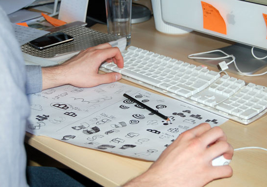
After having a studio meeting and critiquing the logo sketches, a handful were selected to be worked up in Illustrator, in preparation for a presentation with Union Room. We opted to go with three routes to present.
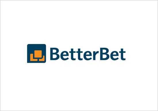
The first route was based on the more celebratory aspect of betting. The Betterbet logo marque is an abstract icon of a man in the throes of celebration upon winning his bet, throwing his arms into the air. This alludes to the point that, when betting with Betterbet you have more of a chance of a successful stake, due to the indepth statistical knowledge that they provide as part of their service. The font chosen was a friendly and appealing sans serif to aid the welcoming appeal of the man’s celebration. A warm orange was chosen to enhance the appeal, alongside a darker rich blue, to exude a feeling of wealth.
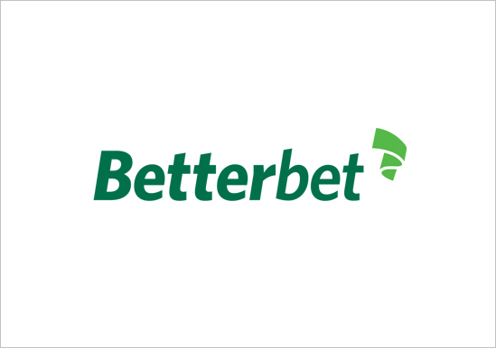
Our second option went for the use of an abstract finish line, to show Betterbet as a pace setting betting brand. The second option utlises an italicised sans serif to give the logotype a dynamic sporting edge. The colours chosen are a dark green off set with a more striking, brighter green.
Our third route…
After much discussion and assessment with Glen and Jordan from Union Room, we came to a decision. We opted for route 3, the graphic target. This symbolises the fact that Betterbet gets it spot on due it being the most informed of all betting brands. It hunts down the best odds, has in depth background information, so you know you have the full picture before pledging your money.
In terms of colour, the idea was to keep it fresh and modern giving it a unique colour scheme to separate it from other bookmakers. We were also keeping in mind the “value for money” overall look and feel of the brand. When choosing logotype we opted for a no-nonsense bold sans-serif approach. The type Akzidenz Grotesk, being a sans serif will ensure a contemporary feel due to it’s ageless quality. Overall we feel that the identity really does it’s job in representing the core values of the Betterbet brand.
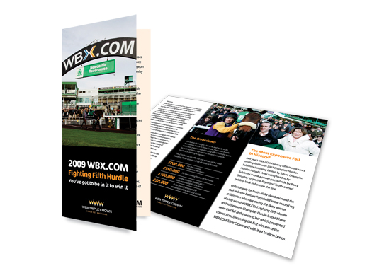
This isn’t our only experience of branding for a betting brand. In 2004 we were approached by WBX a relatively new online betting exchange. We helped build the brand and position the betting exchange within the marketplace that would really challenge the already established online bookmakers. This would be achieved through successful advertising campaigns around the major sporting events, which would offer new and existing members attractive promotions and incentives. WBX would also sponsor the famous Hurdling Triple Crown, the prize being if one very lucky trainers horse wins all three races, they walk away with a £1 Million bonus in prize money.
The outcomes of our branding programme were all positive. We successfully positioned WBX within the current betting market gaining them a worldwide audience. We helped provide members with up to date exchange prices through advertising campaigns. In addition to this we produced a look and feel for the brands image through a range of communications, which to this day engage with the target audience and current members. We also worked and produced WBX Mobile to the current members, giving them easier access to placing that winning bet.
To sum up, we’d like to say a big congratulations to the fine fellows at Union Room for getting to be part of the feature in .Net. Well done boys. It’s always nice to see your work published!
Projector are currently: Waiting for kick-off.